
Preparing a t shirt design for printing is an important step that can determine how professional the final shirt looks. A design may look perfect on a computer screen but appear blurry, faded, incorrectly sized, or poorly aligned when printed. Proper preparation helps preserve the quality, colors, details, and overall appearance of the artwork.
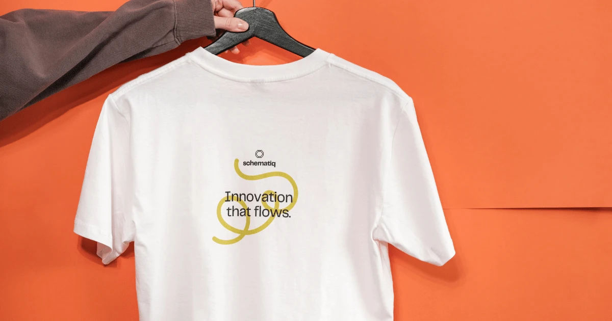
Whether you are creating shirts for a business, event, sports team, personal project, or clothing brand, the printing process starts with a properly prepared file. You need to consider image resolution, dimensions, color mode, background, file format, transparency, and the printing method.
This guide explains how to prepare your artwork for professional and reliable shirt printing. By following these steps, you can reduce printing problems and make sure the finished product closely matches your original design.
Start With the Correct Canvas Size
The first step is creating your artwork at an appropriate size. Avoid designing on a very small canvas and enlarging it later. Increasing the size of a low-resolution image can make edges look blurry and pixelated.
For most shirt printing projects, a common working size is around 12 to 14 inches wide, depending on the printer, garment, and placement. However, the exact dimensions should come from your printer's specifications.
If the artwork will be placed on the chest, sleeve, or back, each location may have different size limitations. Ask your printing company for its recommended maximum print area before completing the design.
Working at the final intended size makes it easier to judge small details. Text, lines, icons, and other elements should remain clear when viewed at actual print size.
Use High-Resolution Artwork
Resolution is one of the most important factors in preparing artwork for printing. A low-resolution image can look acceptable on a phone or computer but become noticeably pixelated when transferred to fabric.
For raster artwork, 300 DPI is a common target for high-quality printing. DPI means dots per inch and describes the amount of image detail available for printing.
For example, if you want an artwork file to be 12 inches wide at 300 DPI, the image should generally be about 3,600 pixels wide.
However, DPI alone does not magically improve an image. Changing a small image from 72 DPI to 300 DPI without adding genuine detail does not create a sharper original. The artwork itself needs enough pixels to support the desired print size.
Whenever possible, start with a high-resolution source rather than enlarging a poor-quality image.
Choose Vector Artwork When Appropriate
Vector graphics are particularly useful for logos, typography, symbols, illustrations, and artwork made from simple shapes.
Unlike raster images, vectors are created using mathematical paths. They can usually be scaled larger or smaller without losing sharpness.
Common vector formats include AI, EPS, and SVG. Some printers may also accept PDF files containing vector artwork.
A vector-based t shirt design is especially useful when you need the same artwork printed in different sizes. A small chest logo and a large back print can be created from the same vector source while maintaining clean edges.
Not every design needs to be vectorized. Photographs and detailed digital paintings are normally raster-based. In those cases, a sufficiently high-resolution image is more important.
Check the Color Mode
Colors can change between a computer display and printed fabric. Screens typically use RGB light, while many printing workflows use other color systems depending on the technology.
RGB stands for red, green, and blue. It is commonly used for digital screens.
CMYK stands for cyan, magenta, yellow, and black. It is commonly associated with traditional four-color printing.
Some direct-to-garment and digital printing workflows may prefer RGB files because their equipment and software handle color conversion internally.
For this reason, you should not automatically convert every file to CMYK without checking your printer's requirements. The safest approach is to ask the printer which color profile and file setup they prefer.
This can prevent unexpected color shifts during production.
Understand the Printing Method
Different printing methods require different artwork preparation.
Screen printing is often ideal for designs with solid colors and strong shapes. It usually requires separation of colors, and gradients or complex photographic effects may require additional preparation.
Direct-to-garment printing can reproduce detailed artwork and many colors. It is often suitable for illustrations, photographs, and designs with gradients.
Direct-to-film printing uses a transfer film and can work well for colorful artwork on various garment types.
Sublimation printing has its own requirements and is commonly used for suitable polyester garments. It is especially effective for all-over or highly detailed prints.
Heat transfer vinyl typically works best with simpler shapes, lettering, and limited-color artwork.
Before preparing your final file, determine which printing process will be used. A file that works perfectly for one method may need adjustments for another.
Remove Unwanted Backgrounds
Check whether your artwork needs a transparent background.
If you want only the artwork to appear on the shirt, remove unnecessary white or colored backgrounds. For example, a logo designed to print on a black shirt may not need a large white rectangular box behind it.
A transparent PNG is often useful for digital printing when the background should not be printed.
However, transparency is not always required. Some printing workflows use other file formats or special production processes.
Look closely around the edges of the artwork. Unwanted pixels, white boxes, faint shadows, or background remnants can become visible after printing.
Cleaning the background is especially important when the garment color is different from the background color used while designing.
Make Sure Text Is Readable
Text should remain clear at the final printing size.
Avoid extremely thin fonts if the printing process may struggle with small details. Very narrow lines and tiny letters can lose clarity during production or after repeated washing.
Choose fonts that match the purpose of the shirt. A sports shirt may benefit from bold typography, while a casual brand may use a clean modern typeface.
Check spacing between letters and words carefully. Text that looks balanced on a large monitor can sometimes appear too crowded when printed.
If your printer requests outlined text, convert the fonts to outlines or shapes before exporting the final file. This helps prevent font substitution when the file is opened on another computer.
Keep an editable version with live text before converting anything to outlines.
Pay Attention to Fine Details
Fine details can make artwork look impressive on screen but may not always reproduce accurately on fabric.
Extremely thin lines, tiny dots, small gaps, and intricate patterns should be checked at actual size.
Zooming in to 400% or 800% can help you inspect the file, but it should not be the only test. Also view the artwork at 100% so you can judge what the customer is likely to see on the finished garment.
Simplifying unnecessary details can sometimes make a t shirt design stronger and more recognizable.
A clean design often performs better than one overloaded with tiny elements.
Consider the Shirt Color
The color of the garment can significantly affect how the artwork looks.
A design that works beautifully on a white shirt may need adjustments for black, navy, red, or other dark garments.
Dark garments can require a white underbase or another printing adjustment, depending on the printing method. Without the appropriate preparation, colors may appear less vibrant than expected.
When creating artwork, preview it against the actual shirt color whenever possible.
This lets you identify problems with contrast before sending the file to production.
Check Contrast
Good contrast helps artwork remain visible from a distance.
For example, dark blue lettering on a black shirt may be difficult to read. Similarly, pale yellow artwork on a light cream shirt may have insufficient contrast.
Contrast is particularly important for typography.
Ask yourself whether someone can understand the main message quickly. If the answer is no, consider changing the colors, adding an outline, adjusting the background, or simplifying the composition.
A strong t shirt design should remain recognizable without requiring the viewer to study it closely.
Use the Correct File Format
The appropriate file format depends on the printing company and production method.
PNG files are commonly used for raster artwork with transparent backgrounds. They can preserve image quality without the compression associated with some formats.
PDF files are widely used for professional artwork and can contain both raster and vector elements.
AI and EPS files are commonly used for vector artwork.
TIFF files can also be useful for high-resolution raster graphics.
JPEG files may be accepted, but they use lossy compression. Repeated editing and saving can reduce image quality.
Never assume that one file type is universally best. Confirm the printer's preferred format before exporting your final artwork.
Set the Correct Print Dimensions
Do not rely on the printer to resize your artwork without discussing the intended dimensions.
Specify the width and height you want whenever possible.
For example, if a front print should be 11 inches wide, prepare and preview the artwork at that approximate size rather than designing something much larger and expecting the printer to determine the final scale.
Correct sizing also helps you evaluate readability and proportions.
Remember that print dimensions can vary according to garment size. A design that looks appropriate on an adult large shirt might look too large on a small shirt.
Check Placement and Alignment
Artwork should be properly aligned before printing.
For a center chest design, use guides to find the horizontal and vertical center. Do not rely entirely on visual estimation.
Consider the distance between the collar and the artwork. A print positioned too high can look uncomfortable, while one positioned too low may appear unbalanced.
Sleeve prints, pocket designs, full-back artwork, and oversized prints each require different placement considerations.
Create a mockup before production if possible. A realistic mockup gives you a better understanding of how the artwork will look on an actual garment.
Proofread Everything
One of the easiest mistakes to avoid is a spelling error.
Before submitting the final file, carefully check every word, number, name, date, and slogan.
Ask another person to review the artwork as well. A second pair of eyes can catch mistakes that you have become accustomed to seeing.
Check punctuation and capitalization too.
Once artwork has been printed, correcting an error may require producing an entirely new batch of shirts.
Create a Print-Ready Master File
Keep your original editable file safely stored.
This master file should contain editable layers, fonts where appropriate, vector elements, and other production information.
Then create a separate print-ready copy according to your printer's specifications.
This workflow protects the original artwork. If the printer requests a different size or color adjustment later, you can make changes without rebuilding the entire design.
Use clear file names such as:
“BrandLogo_BlackShirt_PrintReady”
or
“EventShirt_FrontDesign_12in”
Avoid confusing names like “final-final-new2.psd.”
Organized files make future revisions much easier.
Inspect the File Before Sending It
Before uploading your artwork, perform a final quality check.
Look for pixelation, unwanted backgrounds, incorrect colors, missing elements, spelling mistakes, uneven spacing, and alignment problems.
Check that the dimensions are correct.
Make sure transparency works as intended.
Confirm that fonts and linked images are properly embedded or converted according to the printer's requirements.
If you are using a vector file, inspect the paths and make sure there are no accidental objects outside the intended artwork.
This final inspection can save both time and money.
Request a Proof When Possible
A digital proof or physical sample can help identify problems before a large production run.
A proof allows you to evaluate the approximate appearance, size, placement, and color of the artwork.
Keep in mind that a screen preview cannot perfectly reproduce the appearance of ink or fabric. A physical sample is generally more useful when color accuracy and garment appearance are critical.
If you are ordering a large quantity, approving a sample before full production can reduce the risk of expensive mistakes.
Avoid Common Preparation Mistakes
Several mistakes occur frequently when people prepare artwork for shirt printing.
One common mistake is submitting a tiny image and expecting the printer to make it large without losing quality.
Another is using colors that do not provide enough contrast with the garment.
Ignoring transparency can also produce unwanted backgrounds.
Some designers forget to check the actual print dimensions and only discover the problem after seeing the finished shirt.
Using extremely small text and delicate lines can also create disappointing results.
Finally, sending the wrong file format can delay production.
Most of these problems can be prevented with a simple pre-print checklist.
A Simple Pre-Printing Checklist
Before submitting your artwork, confirm the following:
-
The artwork is created at the correct dimensions.
-
Raster images have sufficient resolution.
-
Vector artwork remains clean and scalable.
-
The color setup follows the printer's requirements.
-
The background is removed when transparency is required.
-
Text is large enough to read.
-
Fine details are suitable for the printing method.
-
Colors provide enough contrast with the shirt.
-
The artwork is correctly positioned.
-
Spelling and numbers have been checked.
-
The file is saved in the requested format.
-
A print-ready copy has been created.
-
The original editable file has been safely stored.
-
A proof has been reviewed when available.
Conclusion
Preparing artwork correctly is just as important as creating the artwork itself. A creative idea can lose its impact if the file is too small, colors are poorly selected, text is unreadable, or the artwork is incorrectly positioned.
The best approach is to prepare your file according to the printer's exact requirements. Start with the correct dimensions, use high-quality artwork, select suitable colors, remove unwanted backgrounds, and inspect every detail before submission.
Remember that the printing method matters. Screen printing, direct-to-garment printing, direct-to-film transfers, sublimation, and heat transfer vinyl all have different production requirements. Knowing the method in advance allows you to prepare the artwork appropriately.
Always keep an editable master copy and create a separate production-ready file. This gives you flexibility if the printer asks for revisions or if you later want to create another version.
A successful t shirt design should not only look good on a computer screen. It should also maintain its clarity, contrast, proportions, and visual impact when transferred to fabric.
Taking a few extra minutes to check resolution, dimensions, colors, transparency, typography, and placement can prevent expensive mistakes. When the artwork is prepared carefully, the printer has a much better foundation for producing a clean and professional result.
The goal is simple: create artwork that is technically ready, visually balanced, and suitable for the chosen printing process. With the right preparation, your finished shirts can look much closer to the original design you created.